Hana—Japanese for “flower”—is a cannabis brand shaped by the quiet strength of the high desert. The owner came to us seeking a refined, artful alternative to the loud, overcrowded landscape. He envisioned a brand rooted in purity and presence, where every detail reflected uncompromising quality and integrity.
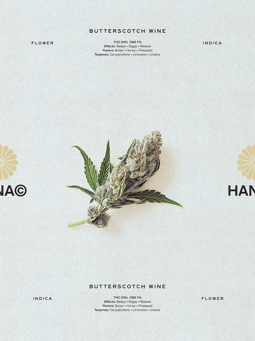
We built a strategy around refined storytelling and modern craftsmanship, positioning Hana as a brand moving cannabis forward through thoughtful design and restraint. Its offering reflects that ethos: premium, small-batch strains selected for potency and experience—not trend.
The identity draws from clean Japanese design principles and the sun-faded palette of the Southwest. Shades like “Pith,” “Clay Petal,” and “Saltbrush” create a system that feels soft-spoken yet assured. A modern wordmark paired with a reimagined chrysanthemum emblem—honoring traditional Japanese iconography through a contemporary lens—to help signal an elevated shelf presence.
From packaging to in-store posters, every touchpoint reinforces the brand’s quiet clarity. Typography remains restrained, allowing the product story to take center stage. The result is a brand defined by calm confidence and crafted intention.
Creative Direction, Art Direction, Visual Identity